Summary
Good photography doesn’t need decoration. A strong image works on a subconscious level, it hits the senses before the mind has time to analyse. A website should never stand in the way of that process. Whether it’s fine art or commercial work, the impact must remain uninterrupted.
Sometimes the distractions are obvious: clashing colors, broken layouts. But more often they’re subtle: a poor typeface, uneven rhythm, or awkward spacing. These small details shape how the photograph is perceived, and they can either strengthen or weaken its effect.
Commercial or Creative – Minimalism Wins
I’ve found this balance matters no matter what kind of photography you do. With commercial work like products, portraits, campaigns, the website becomes a signal of precision. Clean presentation communicates professionalism before the client even contacts you. It says: this person cares about detail, this person delivers quality.
With artistic work, the portfolio works more like a gallery wall: calm, spacious, carefully considered, giving each photograph the presence it deserves. In both cases, the principle is identical, the design steps aside, so the image can take over. That’s when a portfolio starts to feel powerful: nothing distracts from what really matters.
Examples of Great Photographer Portfolios:
1. Anna Venezia

Anna Venezia is a photographer and illustrator based in Nice, France, originally from New Hampshire. She studied Photography and Literature at Sarah Lawrence College and her work spans still life, landscape, and portraiture. What ties it together is a fascination with memory, time, and the uncanny qualities of daily life, the images that feel both familiar and slightly off. Alongside personal projects, she takes on commissions across Europe and the US, from musicians to companies and private clients.
Her website reflects this duality of clarity and strangeness. The navigation is stripped down to essentials, the Portfolio, Services, and About. While the homepage is simply a list of series titles leading directly into full-screen images. Each project unfolds as a rhythm of photographs with minimal text, letting viewers feel the subtle shifts in tone. The lack of visual clutter works in her favor: the design fades into the background, so the quiet tension of her images can fully take hold.
2. Michael Kowalczyk

Michael Kowalczyk is a street and documentary photographer who moves easily between film and digital. Originally from Germany, he has exhibited internationally, from Miami to Milan, Siena, Sharjah, and London, and won awards at contests including the Siena International Photo Awards and the Refocus Awards. His work often begins with wide-angle observations of public life, playing with perspective to capture both atmosphere and detail. Beyond shooting, he writes gear guides, runs workshops, and coaches photographers in street practice and editing.
His website shows how clean design can perfectly support analog photography. Film already carries its own atmosphere, it’s the grain, the colors, the imperfections, and these can easily be undermined by digital gimmicks. Autoplay sliders, parallax scrolls, heavy transitions, or flashy hover effects would only clash with the natural texture of the images. By keeping the layout simple and neutral, the site avoids that trap. The result is a presentation where film work feels authentic and powerful, exactly as intended.
3. Andy Bones

Andy Bones works across many fields of photography, from landscapes and portraits to urban studies and architecture. What unites his practice is a visual, almost painterly sensitivity: whether the subject is a human face, a building, or a stretch of countryside, each image feels considered and deliberate.
His website manages to hold these different threads together. Color portraits appear next to stark black-and-white landscapes, yet the presentation keeps them coherent. The layout is vertical, letting each photograph take up the full height of the screen, so viewers encounter the work almost like panels in a triptych. It’s a smart solution: variety without chaos, contrast without fragmentation. The design is so restrained that it quietly balances the different moods of his work, allowing them to resonate side by side.
4. Fabiana Hrubiš Mertová

Fabiana Hrubiš Mertová (*1989) is a Czech photographer and video artist. She specializes in portraits and actor headshots, but her practice also includes behind-the-scenes film stills, product photography, and video documentation. In her personal projects, she explores conceptual photography and video art. Coming from a family of artists, she has long combined photography with music, performance, and collaborative projects, from playing in a band to creating music videos with her husband.
Her website makes this breadth of practice feel coherent. The navigation separates commercial categories like headshots or product photography from personal projects and video work, so visitors can easily switch contexts. Simplicity is key: when one portfolio holds polished headshots, experimental video stills, and conceptual art side by side, the layout itself must stay neutral. Here it works, the site feels unified without blurring the differences, letting Fabiana’s varied practice come through clearly.
5. Verity Gill

Verity Gill is a Sydney-based photographer working on Gadigal land. She studied design and photography at UTS and UNSW, and her path has taken her from designer and animator to photographer, with more than 18 years of experience. She grew up around a darkroom and still carries that sense of magic into her work. Today, her focus is maternity, newborn, family, and personal branding photography, shaped by her own life as a mother and her interest in the human body, movement, and relationships. Her approach is documentary and honest, aiming to capture the unscripted beauty of real life.
Her website reflects that ethos of authenticity. The navigation splits her practice into two clear paths, Family and Business. While the design remains bright and uncluttered. Full-width images dominate, supported by conversational text that feels personal rather than polished marketing copy. What stands out is how the site communicates both warmth and professionalism: visitors see not only her photographs but also the values behind them, the honesty, intimacy, and inclusivity. It feels like an invitation rather than a showcase, which fits her work perfectly.
6. Mike Newton

Mike Newton’s work is rooted in long-term, place-driven projects. Series like Forth and Roslin Glen show a photographer returning again and again to the same terrain, attentive to changes in light, season, and atmosphere. It’s a patient, reflective practice, more about observing over years than chasing quick results.
His website carries the same sense of restraint. A fixed menu sits on the left, while the main area is built from simple tiles, each project marked only by its title and year. Opening a series reveals a calm sequence of images with no extra ornament. The design never tries to impress on its own terms; instead, it establishes a steady rhythm that matches the slow pace of the work itself. It’s a reminder that clarity and consistency can be powerful design choices when the photographs are meant to speak quietly but with depth.
7. Markenson Pierre

Markenson Pierre is a photographer who uses his camera to capture emotions, stories, and fleeting moments that turn into lasting memories. His subjects range from vehicles and landscapes to events and street life, but the thread is always the same: authenticity and creativity in everyday scenes.
His website brings order to this variety through a minimalist, well-structured design. A dark background with clear white text creates contrast, while the portfolio is neatly divided into categories that make navigation effortless. Even with many directions in his work, the presentation feels coherent rather than chaotic. What makes it stand out is the combination of a disciplined, minimal layout with a personal blog. The blog adds context and voice, showing not only finished photographs but also the thinking behind them, making the site feel both professional and approachable.
https://markensonpfotografie.space
How Were These Websites Built?
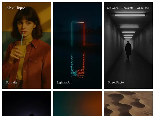
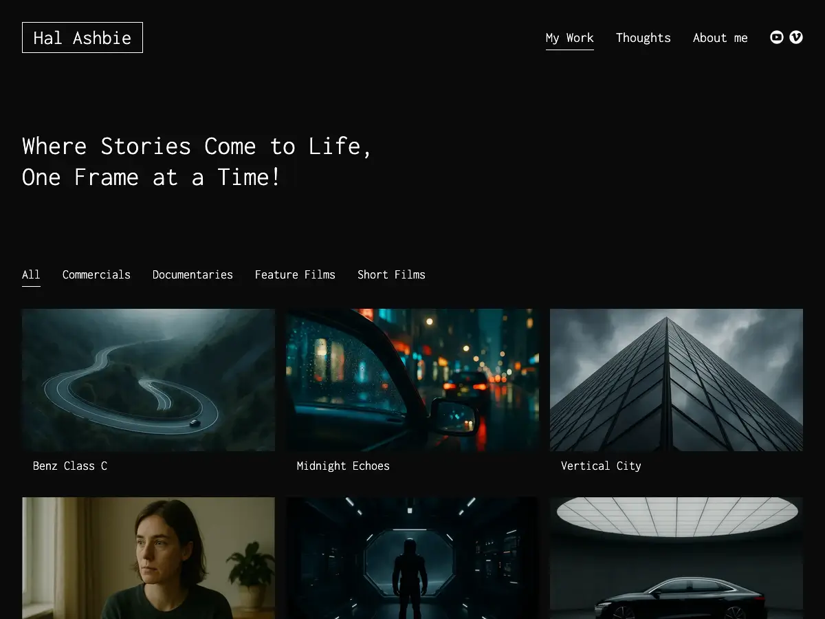
All of the photography portfolios featured in this article have been created with the Minimalio WordPress theme, a minimalist theme designed specifically for creative professionals who want their images to stand out without distraction. Minimalio gives photographers a framework that keeps the interface invisible, so the work itself becomes the focus.
Why It’s Ideal for Photographers:
- Display photographs large and sharp with clean, unobtrusive typography
- Organize projects into simple, dedicated portfolio pages
- Use flexible grids that adapt seamlessly to desktop and mobile
- Maintain a neutral, minimal design that never competes with the images
Minimalio is available in a free version to get started quickly. For more advanced needs, the Premium Plugin transforms it into a complete professional portfolio system — with one-click demo imports, deeper customisation, and layouts that feel as carefully edited as your photographs.
Good luck with your portfolio.