Summary
As 2026 begins, having a solid online presence has become a natural part of presenting our work (me included). That has been true for years, so there is nothing new about it. What keeps changing is the level of quality people expect. By that, I mean clear structure, fast loading, and a design that makes sense instantly. These things are no longer optional. They are the baseline now.
Minimalistic WordPress themes fit this shift well because they keep the interface quiet, navigation obvious, and pages reliable under real world conditions. That is why I put together this overview of minimalist WordPress portfolio themes for 2026 that meet those expectations.
Criteria for my selection
These criteria reflect what I consider important for creators in 2026. They are intentionally general and apply across different creative fields. If you are looking for recommendations tailored specifically to photographers, designers, architects, or some other professions, there are dedicated articles on my blog. This theme selection is based on the following criteria:
- Easy to orient design with clear structure
- Fast loading without unnecessary scripts or effects
- Actively maintained and not visually or technically outdated
- Easy to deploy and set up without heavy configuration
- Works well with the WordPress block editor
- Reliable across devices and screen sizes
- Does not impose a strong visual style over the work, with a few deliberate exceptions
1. Minimalio Theme
http://minimalio-test.mikulaskarpeta.net/domains/minimalio-test.mikulaskarpeta.net/

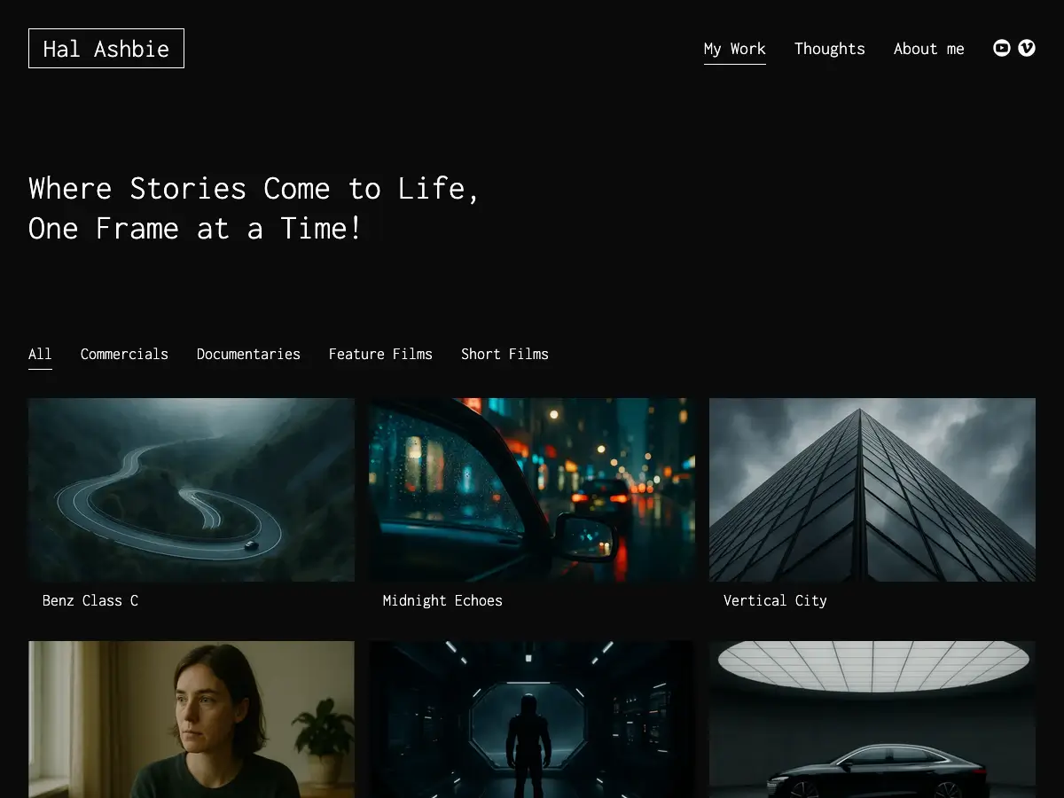
Minimalio started as my response to portfolio themes that claimed to be simple, but slowly introduced clutter and unnecessary features. The goal was clear from the beginning. Build a theme that stays truly minimal, remains fast, and keeps all attention on the work itself.
The free version covers the essentials. A lightweight portfolio theme with a clear structure and no distractions. The Premium plugin expands this foundation with additional tools, most notably a built-in gallery that you can arrange using simple drag and drop. This turns Minimalio into a complete portfolio solution without relying on third-party gallery plugins or complex setups.
Minimalio is designed for creators who want a reliable, focused base that does not get in the way as their portfolio grows.
Advantages
- Designed specifically for minimalist portfolios
- Clean structure, fast loading, and easy setup
- Premium plugin includes a drag-and-drop gallery for an out-of-the-box portfolio solution
Disadvantages
- The stripped-down design puts full emphasis on the work itself
- No WooCommerce support, as the theme is focused purely on portfolios
Examples of portfolios made with Minimalio:


2. Hideo
https://andersnoren.se/teman/hideo-wordpress-theme/

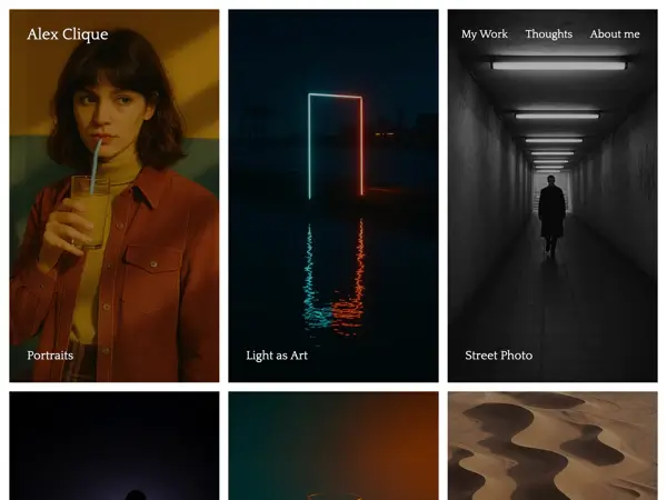
Hideo is a very clean and focused portfolio theme built around speed and clarity. The layout stays minimal, with a simple menu and a grid of preview images that make projects easy to scan and enter. There is no extra structure and no visual noise, which helps visitors get to the work immediately.
A small but noticeable detail is the use of rounded corners, which softens the layout without making it decorative. Typography stays minimal, but carries enough character to avoid feeling generic. If you want a theme that works well for photographers, this is could be a good choice. You can also check my separate list of Minimalist WordPress Themes for Photographers.
Advantages
- Very clean layout with a strong focus on thumbnails
- Rounded corners give the layout a softer tone
- Works well for photography portfolios
Disadvantages
- Better suited for smaller portfolios
- Limited layout variety
- May not suit everyone
3. Promoter
https://wordpress.org/themes/promoter/

Promoter is a very stripped-down portfolio theme with a clear focus on essentials. The layout stays simple and predictable, with intro text, a grid of work, and a basic menu. There are no side features competing for attention, which makes the structure easy to understand at a glance.
A useful detail is the color system. You can switch background and accent palettes quickly, which helps change the overall mood without touching the layout. That makes Promoter a good fit if you want a minimalist structure but still need some visual flexibility through color.
Advantages
- Simple structure focused on portfolio content
- Color variations allow quick visual changes
- Backed by Automattic with reliable updates
- Free and quick to set up
Disadvantages
- Very minimal, can feel too bare for larger sites
- Limited flexibility compared to more customizable themes
- Works best for small, focused portfolios
4. Dawson
https://wordpress.org/themes/dawson/

Dawson is a clean, lightweight portfolio theme built around a simple two-column layout. The structure is straightforward and familiar, which makes galleries and projects easy to scan. Several style variations let you adjust the overall mood without changing the layout, so the presentation stays consistent while still offering some visual choice.
The theme keeps expectations low and clear. It covers the basics of a portfolio without adding extra layers. That makes it reliable, but also means it does not push the format forward or offer much depth beyond the default structure.
Advantages
- Clean two-column layout that works well for galleries
- Multiple style variations for quick visual changes
- Backed by Automattic with reliable updates
- Suitable for photography portfolios
Disadvantages
- Customization is limited beyond provided styles
- Adds little beyond a standard portfolio structure
- Still relatively new with fewer real-world examples
5. Adonay
https://wordpress.org/themes/adonay/

Adonay is a clean and professional portfolio theme built for showcasing work in a calm and controlled way. The layout is spacious, typography feels elegant, and animations stay subtle, so nothing pulls attention away. It works well for portfolios where you want a polished presentation rather than visual excess.
Advantages
- Clean and professional visual style
- Multiple portfolio layouts available
- One-click demo import
- Responsive and retina-ready
Disadvantages
- Limited advanced customization without a page builder
- Fewer niche specific layouts than some competitors
- Not suitable for larger body of work
6. Portfolio WP
https://wordpress.org/themes/portfolio-wp/

Portfolio WP is a block-based theme designed specifically for creative portfolios. The layout feels clean and neutral, with large headings, generous spacing, and clearly defined project sections. Instead of pushing a strong visual style, the theme focuses on giving you a solid structure you can shape through the Site Editor.
A key part of the experience is the set of custom block patterns. Ready-made layouts for galleries, case studies, and portfolio grids make it easier to assemble pages without starting from scratch. The result depends heavily on how much care you put into typography and color, but the base stays flexible and controlled.
Advantages
- Built specifically for portfolio sites
- Useful block patterns for galleries and project layouts
- Full support for the WordPress Site Editor
- Clean structure that adapts to different types of work
Disadvantages
- Neutral design can feel generic without customization
- Requires design effort to stand out
- Less personality than more opinionated themes
7. Imbalance
https://wpshower.com/theme/imbalance/

Imbalance is a classic minimalist grid theme built around clarity and balance between images and text. Projects sit in a clear three-column layout, with straightforward navigation that makes categories and sections easy to understand at a glance. Typography and imagery support each other without competing, which gives the theme a functional and predictable feel.
The design stays clean and practical. The only element that slightly breaks the minimal tone is the row of social icons in the header. Overall, Imbalance works well if you want a simple structure for presenting a larger amount of visual work without unnecessary complexity.
Advantages
- Clean three-column grid with a strong sense of order
- Typography and images feel well balanced
- Clear navigation with logical category structure
- Free to use and lightweight
Disadvantages
- Social icons add visual noise to an otherwise minimal layout
- Older theme with limited modern block support
- Fewer updates compared to newer themes
8. Vueo
https://wordpress.org/themes/vueo/

Vueo takes a more playful approach to a minimalist grid. Instead of forcing all projects into the same shape, it alternates thumbnail aspect ratios, which creates a looser and more curated rhythm. The layout still stays clean and controlled, but feels less mechanical than a standard grid. This works well when your work spans different formats and you want the presentation to feel editorial rather than rigid.
Setup is simple and block based, with support for the Site Editor. The theme does not offer many structural variations, so the visual result depends heavily on the strength and consistency of the projects themselves. If you do graphic design, this theme fits well. I also put together a separate list of WordPress themes for graphic designers.
Advantages
- Alternating grid creates a more natural visual rhythm
- Clean and minimal without feeling rigid
- Built around the WordPress block editor
- Backed by Automattic with reliable updates
Disadvantages
- Less conventional grid may not suit everyone
- Limited customization beyond the default layout
- Requires consistently strong imagery to work well
9. Bhuta
https://wpkoi.com/bhuta-wpkoi-wordpress-theme/

Bhuta is a bold portfolio theme that does not aim to stay neutral. Typography dominates the design and sets a strong tone from the first glance. The visual style is intense and works best when you treat the layout as part of the presentation, not just a frame. Despite the aggressive look, the structure itself stays clean.
This theme works best with a small, carefully selected set of projects. A few strong pieces feel intentional and focused. Once the content grows, the visual weight can quickly become overwhelming, so curation matters more here than with quieter themes.
Advantages
- Very strong typographic identity
- Clean underlying layout despite a bold visual style
- Effective for presenting a small number of selected projects
Disadvantages
- Too intense for some minimalist portfolios
- Not suitable for content heavy sites
- Requires careful curation to work well
10. Siddhi
https://wpkoi.com/siddhi-wpkoi-wordpress-theme/

Siddhi also takes a very bold, poster-like approach to layout and typography. Oversized type, heavy grids, and strong visual elements make it feel more like a graphic statement than a quiet frame. While it is technically a multipurpose theme, the demo presentation pushes it closer to a showcase style, where design presence comes first and content follows.
It can work well for designers who want their portfolio to feel personal or experimental. At the same time, the built-in extras like icons, animations, and large headers can easily overpower the work if you are aiming for a strict minimalist presentation.
Advantages
- Oversized, poster-like typography with high visual impact
- Responsive and easy to customize via Elementor
- Free version available with an option to upgrade
- WooCommerce support if selling products is part of the site
Disadvantages
- Feels closer to a multipurpose theme than a focused portfolio
- Visual extras can distract from the work
- Heavier setup due to reliance on Elementor
11. Darken
https://wordpress.org/themes/darken/

Darken is a portfolio theme built around atmospheric presentation. The color scheme, dramatic typography, and smooth transitions give the site a strong mood from the start. It is designed for work that benefits from contrast and immersion, especially when visuals need to feel bold and cinematic rather than neutral.
The theme supports fullscreen galleries and video backgrounds, which makes it effective for projects where scale and presence matter. Setup stays accessible thanks to demo import and compatibility with common page builders, but the overall look is very opinionated and not easily softened.
Advantages
- Strong dark visual style with high impact
- Fullscreen galleries and video background support
- One-click demo import
- Responsive and retina-ready
Disadvantages
- Dark aesthetic will not fit every type of work
- Limited options for light or neutral variations
12. Arkhe
https://wordpress.org/themes/arkhe/

Arkhe is a lightweight theme built with performance and the block editor as the main priorities. It keeps the core theme minimal and pushes most advanced layout control into companion plugins. This approach keeps the base fast and flexible, but also means the theme reveals its full potential only if you are willing to extend it.
Arkhe makes the most sense if you care about speed, clean code, and working directly with Gutenberg. It is less about visual style and more about giving you a solid technical foundation to build on.
Advantages
- Very lightweight and performance focused
- Designed specifically for the Gutenberg editor
- Clean, extendable codebase
Disadvantages
- Advanced layout features depend on companion plugins
- Some documentation is only available in Japanese
- Limited value if you do not use Gutenberg as your main editor
13. Clearwork
https://agnarson.com/wpthemes/clearwork/

Clearwork leans more toward structure and editorial content than a minimal showcase. The homepage includes navigation, a visible bio, and additional elements that make the site feel closer to a studio or magazine layout. Typography plays a big role here. The serif typeface adds a refined, almost editorial tone that shapes the overall impression.
One practical strength is flexibility in thumbnails. Different aspect ratios are supported, which helps when projects vary in format. At the same time, the amount of structure can slow things down and pull attention away from the work if you are aiming for a fast, friction free presentation.
Advantages
- Supports multiple thumbnail aspect ratios
- Strong structure suited for content heavy or studio style sites
- Serif typography creates an editorial feel
Disadvantages
- Too structured for a minimal, focused portfolio
- Homepage elements can distract from the work
- Not ideal for quick, lightweight browsing
14. Expositio
https://wpshower.com/theme/expositio

Expositio uses a very traditional portfolio structure. A sidebar menu sits on the left, while projects live in a simple grid on the right. The layout is familiar and predictable, which makes it easy to set up and easy to navigate. Nothing tries to stand out, and that is very much the point.
The theme stays universal and unobtrusive, but that also means flexibility is limited. You mostly work within the given structure, and the overall feel leans more classic than contemporary. It can still work well if you want a no-frills frame and do not need frequent updates or modern layout tools.
Advantages
- Simple, universal layout that stays out of the way
- Minimal navigation keeps focus on the work
Disadvantages
- Feels dated compared to newer portfolio themes
- Limited flexibility and layout options
15. Havi
https://wordpress.org/themes/havi

Havi is a modern minimalist theme designed to present work with clarity and restraint. The layout stays clean, typography is thoughtful, and projects remain the clear focal point. Setup is straightforward, which makes it suitable if you want a polished portfolio without spending time on complex configuration. The theme avoids extra features and focuses on performance, so it loads fast and stays consistent across devices.
Advantages
- Clean, minimalist design focused on portfolios
- Fast loading and responsive
- Simple setup with only essential elements
Disadvantages
- Limited flexibility for more complex sites
- Fewer customization options than feature-heavy themes
16. Dorya

Dorya is a dark mode portfolio theme designed for digital agencies and creative freelancers who want a modern, professional presence. Built with Elementor, it offers flexible customization through a header and footer builder, multiple portfolio layouts, and 100+ custom elements. The theme includes pre-built case study templates and page layouts that can be imported with one click, making setup faster. Dark mode is a core feature that can be applied across all elements, though standard light themes work just as well. The design balances visual appeal with performance optimization.
Advantages
- Full dark mode support with light mode option
- Elementor integration offers extensive customization
- Multiple portfolio and case study layouts included
- One-click demo import speeds up setup
Disadvantages
- Requires Elementor, adding a layer of complexity
- More features mean a steeper learning curve than minimal themes
- Dark aesthetic may not suit all brand identities
Which to choose?
The right theme depends less on trends and more on how you prefer to work.
If you want a theme that stays focused purely on portfolios, is actively supported, and saves time during setup, Minimalio is the safest starting point. It is simple by design, and with the Premium plugin it becomes a complete solution that works out of the box.
If you enjoy experimenting and are comfortable shaping the presentation yourself, themes like Bhuta or Brute offer much bolder directions. Strong typography and uncompromising layouts can make a clear statement, but they require careful curation to work well.
If you prefer a more neutral and reliable base, themes like Promoter or Dawson keep things simple and predictable. They stay on the basic side, but that can be an advantage if you want full control without unnecessary layers.
Some older themes in this list can still work if you like classic layouts. Just keep in mind that updates are less frequent and flexibility is limited compared to newer block-based themes.
In the end, the best choice is the one that supports your work rather than competes with it.