Summary
A graphic designer’s portfolio always carries two types of design: the web design of the portfolio itself, and the graphic design that is the actual work being shown. The second one must always win.
Nobody is coming to admire your menu animation. They are coming to see posters, logos, type systems, the work you have spent weeks refining. The web should never compete with that. At best, it should disappear.
That is why minimalist WordPress themes make sense for graphic designers. They strip out the gimmicks, keep navigation calm, and leave space for your projects to take over the stage. A good theme is not there to impress. It is there to get out of the way.
Let Your Work Speak, Not the Website
For graphic designers, the website is not decoration. It is infrastructure. It needs to hold your projects in place, make them easy to browse, and never interrupt the viewing. Above all, it should provide clarity, with layouts that can be read at a glance.
Typography must be sharp and flexible, matching the same level of care you put into your own work. And space is just as important, giving enough breathing room so every project stands on its own and gets the focus it deserves.
My criteria for this selection
- Minimal, distraction-free layouts that do not compete with your work
- Strong attention to typography and readability
- Generous use of whitespace for clean visual rhythm
- Lightweight and fast loading, performance matters for credibility
- Available in the official WordPress repository (safe, maintained, and up-to-date)
- Compatible with modern WordPress standards in 2025
1. Minimalio
http://minimalio-test.mikulaskarpeta.net/domains/minimalio-test.mikulaskarpeta.net/

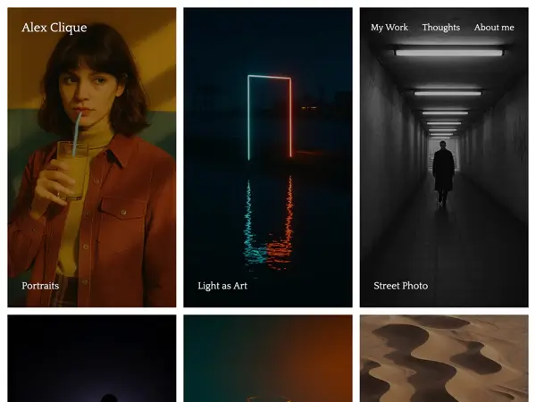
Minimalio is the theme I built because I was tired of portfolio templates that claimed to be “minimalist” but always added clutter. I wanted something different: a theme that would stay truly invisible and let the work, your graphic design, do all the talking.
The free version gives you the essentials: clean structure, fast loading, and no distractions. If you want more, the Premium plugin adds a built-in gallery block, one-click demo imports, and tutorials that walk you through setup step by step. The point is simple: instead of wrestling with plugins or bloated options, you spend your time presenting your projects.
Advantages
- Premium-style features without the price tag
- Easy demo imports for a fast start
- Extensive tutorial library to guide you
- Actively supported, with real examples in the showcase
Disadvantages
- The stripped-down approach means your design work must carry the aesthetic
- No WooCommerce support, this is a portfolio theme, not a shop
2. Imbalance
https://wpshower.com/theme/imbalance/

Imbalance is one of those classic minimalist grid themes that still feels sharp today. It puts projects into a clear three-column layout, where typography and images balance each other without fighting for attention. The navigation is straightforward, categories on top, subcategories neatly listed below, so visitors immediately know where to go.
The overall feel is very clean and functional. The only distraction might be the row of social icons in the header, which slightly breaks the otherwise minimal tone. But if you want a simple, structured way to present a lot of visual work, Imbalance does the job without fuss.
Advantages
- Clean layout with a strong grid structure
- Good typography that works well for portfolios and blogs
- Clear navigation and logical category handling
- Free to use and lightweight
Disadvantages
- Social media icons feel like extra clutter in an otherwise minimal frame
- Older theme, so updates and modern block support may be limited
3. Siddhi
https://wpkoi.com/siddhi-wpkoi-wordpress-theme/

Siddhi is a WPKoi theme that takes a very bold approach. The typography is oversized, grids are heavy, and the whole look feels almost like a printed poster translated onto the web. It is multipurpose at heart, built to work with Elementor and WooCommerce, but the demo design makes it stand out more as a showcase than a quiet portfolio.
For graphic designers who want something loud and experimental, Siddhi can work as a statement piece. But if you are aiming for a calmer, strictly minimalist frame, some of the built-in extras (icons, animations, oversized headers) may feel like too much.
Advantages
- Strong, poster-like typography with high visual impact
- Fully responsive and Elementor-ready, easy to customize
- Free version available with option to upgrade to Premium
- WooCommerce support if you also want to sell products
Disadvantages
- Feels more like a multipurpose demo than a dedicated portfolio
- Visual extras (icons, animations, oversized headers) can distract if overused
- Heavier setup due to Elementor reliance
4. Kigen
https://wordpress.org/themes/kigen/

Kigen is a one-page portfolio theme from Automattic, built with extreme simplicity in mind. Instead of complex navigation or multi-level menus, it gives you a single, straightforward layout where everything fits on one page. Visitors land, see who you are, what you do, and how to contact you, all without any extra steps.
This approach makes Kigen stand out from the rest of the list. It is closer to a digital business card than a full website, which can be useful if you only need the basics. For larger portfolios or anyone looking for more structure, it quickly shows its limits, but as a minimal entry point it delivers what it promises.
Advantages
- Ultra-simple one-page layout
- Backed by Automattic, reliable updates and support
- Fast to set up, no distractions
Disadvantages
- Very limited compared to multi-page portfolio themes
- Not suitable for bigger projects or complex portfolios
- Few customization options beyond the basics
5. Portfolio WP
https://wordpress.org/themes/portfolio-wp/

Portfolio WP is a block-based theme designed specifically for creatives. Out of the box it feels clean and professional, with large headings, generous spacing, and clear project sections. What makes it practical for graphic designers is the set of custom block patterns, ready-made layouts for galleries, case studies, and portfolio grids that you can drop in and adjust directly in the Site Editor.
It is a theme that does not impose a strong style of its own. Instead, it gives you a neutral structure you can shape around your work. That flexibility can be a strength, but also means the final look depends heavily on how much time you spend fine-tuning typography and colors.
Advantages
- Built specifically for portfolios, with useful block patterns
- Full support for the WordPress Site Editor
- Clean, minimal layout that adapts to different kinds of work
- Actively maintained and available on WordPress.org
Disadvantages
- Neutral design can feel too generic without customization
- Requires some design effort to make it stand out
- Limited built-in personality compared to more opinionated themes
6. Tamal
https://wordpress.org/themes/tamal-portfolio/

Tamal is built as a personal portfolio and resume theme, and the design reflects that. Instead of separate pages, it works as a scrolling one-pager. The menu items link directly to sections on the same page, so the whole site feels like a single continuous presentation. That makes it quick to set up and easy for visitors to navigate without ever leaving the main screen.
For graphic designers, this format can work well if you want a compact, CV-style portfolio, everything from an “About” section to project examples and contact details in one place. The trade-off is that it is less suited for large collections of work. If you have many projects to show, the long scroll can start to feel heavy.
Advantages
- One-page resume-style layout with smooth section navigation
- Responsive and retina-ready, mobile-friendly by default
- Simple to customize, quick to launch
- Free and available on WordPress.org
Disadvantages
- Not ideal for large portfolios with many projects
- Feels more like a personal resume than a full design showcase
- Visual style is fairly generic, may require customization to stand out
7. Vueo
https://wordpress.org/themes/vueo/

Vueo is a block-based portfolio theme from Automattic that takes a slightly different approach to the grid. Instead of uniform thumbnails, it alternates aspect ratios, creating a more dynamic rhythm while still keeping everything clean and minimal. The result is a gallery layout that feels curated rather than mechanical, and that is exactly the detail I personally enjoy about it.
The theme is simple to set up and works well if you want your projects to appear in a flowing, magazine-like presentation. For graphic designers, that means you can show different formats, posters, illustrations, photography, without every thumbnail being forced into the same box.
Advantages
- Alternating grid layout creates a natural visual rhythm
- Clean and minimal, but less rigid than standard grids
- Built with the WordPress block editor and Site Editor support
- Backed by Automattic, with reliable updates
Disadvantages
- Less conventional, may not suit those who prefer strict uniformity
- Limited customization beyond the default grid style
- Works best with consistently strong imagery, otherwise the pattern can feel uneven
8. Promoter
https://wordpress.org/themes/promoter/

Promoter is a WordPress theme by Automattic with a very clear idea: show only what is necessary for a portfolio. The layout is stripped down to essentials, intro text, grid of work, and a simple menu. That makes it easy to understand at first glance, without side features or clutter.
What I like is the color system: you can quickly switch between background and accent palettes, which makes the portfolio feel less rigid. Even with a very simple structure, it can still look playful or bold depending on the tones you choose. For graphic designers, that is a nice way to give your portfolio personality without complicating the design.
Advantages
- Extremely simple structure, focused on portfolio only
- Backed by Automattic, reliable updates
- Block-based with clean typography and grid patterns
- Color variations make it easy to create a fun or bold mood
- Free and quick to set up
Disadvantages
- Very minimal, may feel too bare if you want extra sections or features
- Limited flexibility compared to more customizable themes
- Works best for smaller, focused portfolios
Which to choose?
The right theme depends on how you want to present yourself.
If you are looking for something built from the ground up for minimalist portfolios, Minimalio is the safest choice. It is simple by design, with a Premium plugin that saves you time setting up galleries and structure.
For a straightforward one-pager, Kigen or Tamal make sense. They are closer to digital business cards, fast, simple, and easy to grasp, though limited for larger bodies of work.
If you want a neutral starting point that you can shape any way you like, Portfolio WP gives you block patterns and structure without imposing too much style.
In the end, the best theme is the one that does not compete with your graphic design. The site is the frame, your work is the picture.
Good luck!